


A royalty-free image website Shutterstock has updated their complete design to a new one refined, modern, and unpretentious. Just look at these minimal changes, which now look extremely modern with the colors and fonts, all blending into an impressive, but company-wise, somewhat generic layout.
An minimalist aesthetics changed the outdated design, replacing it with sans-serif fonts and looking high-quality with a taste of the latest trends. Those who were expecting a very bold and more colorful image may be surprised, but Shutterstock delivers something else: a rebrand that doesn’t try to steal the spotlight.
It Doesn't Want to Be Loud
Clean, concise and bland - the royalty-free image website gives us a functional and simple new look that meets everything you could want from a restrained new visual identity. It’s not a provocative image, no one has tried to standardize it with other similar websites, everything is calm and good to see, it’s updated, and aligned without any flashiness.
Subtle and Symbolic
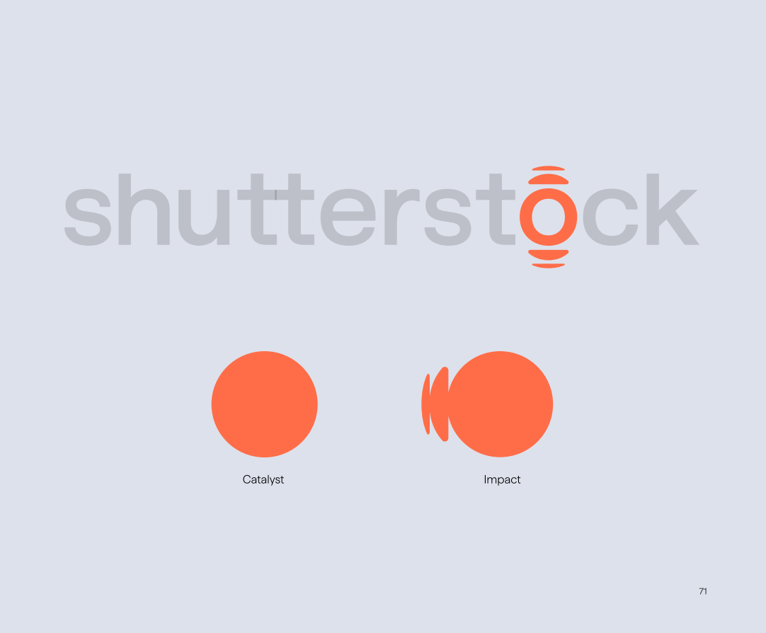
At the heart of the new design lies a dual-symbol logo motif. The graphic over the “O” splits into two thematic concepts. A simple circle dubbed the "spark of an idea" and a ripple design, meant to evoke the creative aftershock that Shutterstock enables. This combination conveys a subtle narrative, providing designers and users with a conceptual framework while remaining deliberately silent.
Introducing a New Font
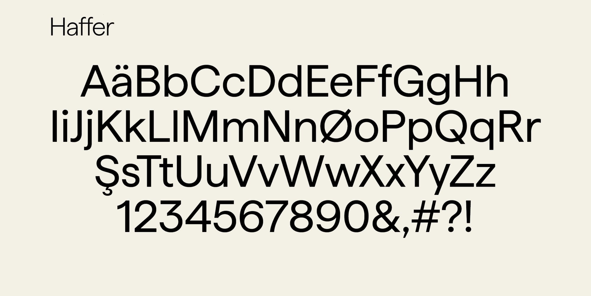
The website chose the Haffer font, which is associated with cleanliness, as it is said to speak softly rather than defiantly. Practical and unpretentious, it embodies authority through its conventionality. Its strength lies in the fact that it is instantly readable and adaptable to various media, so the content can speak for the brand itself, and the authors have very insightfully adapted it to the style of the website, because they know that professionals who need tools, not distractions.
Color Palette
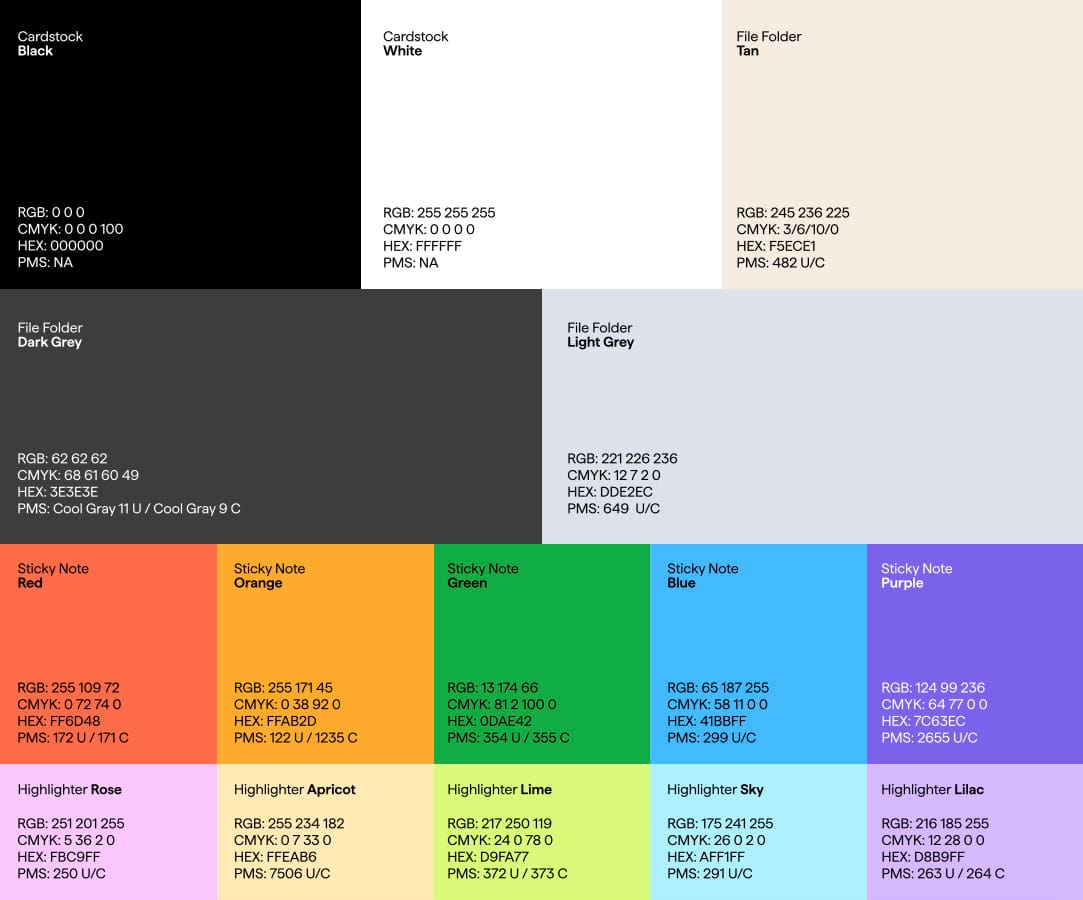
A broad color palette gives the new visual identity a corporate feel that is mature but not heavy and playful but not youthful. Names like “Stick Notes Red” and “Folder Dark Grey” give the refreshed brand a familiar yet everyday aspect that contributes to its “safe” design. A line that few brands dare to follow, but Shutterstock follows it confidently.
Shutterstock has created an identity that speaks for itself and reflects their vision: functional, accessible, and quietly powerful. It’s clean, corporate, and no doubts - safe. However, that safety might just be a matter of strategic excellence. Thank you to those who have watched Shutterstock evolve and for joining me on this amazing journey.


