


Here comes the Pilgrims Choice, the UK's Cheddar cheese brand who have a huge ambitions to represent their crafted cheese and the new look which was created by design company Brandon Consultants is an outstanding.
The Idea
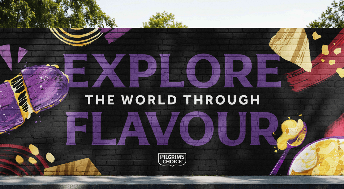
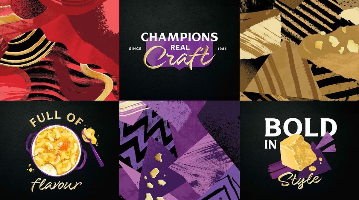
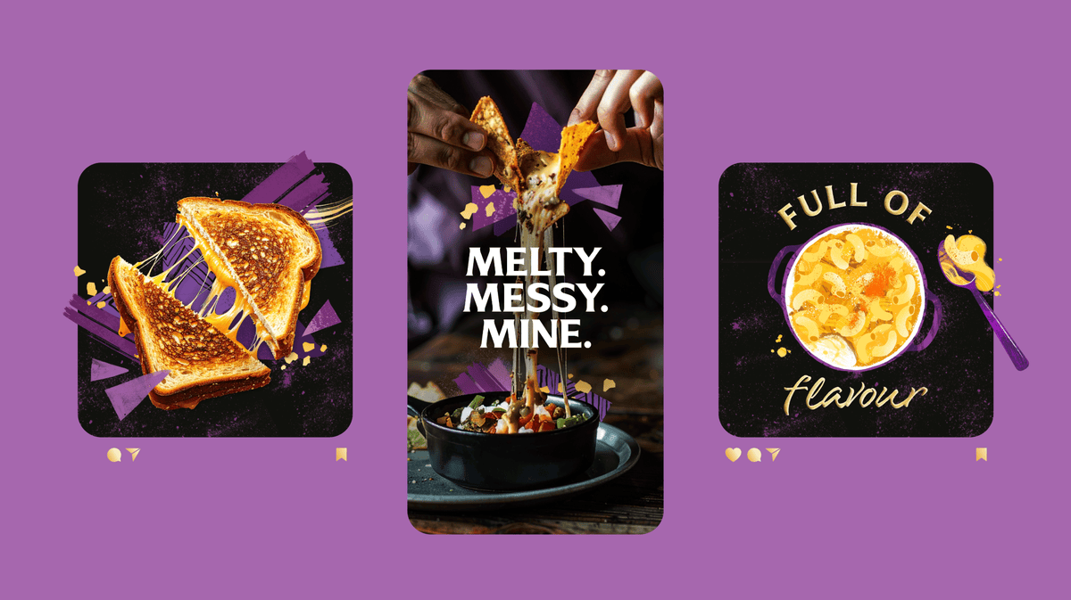
The idea is simple, the design company investigate the client's brand identity and decide to improve it, so comes the idea to reflect its unique character. Articulating flavour through rich visual textures and vivid appetite-stirring visuals, that the design is the same appealing taste like the product it self.
“In a category dominated by own label, our challenge was to shift Pilgrims Choice from a largely promotional buy to a brand of preference,” says Brandon account director Emma Bell.
Challenge
It's a huge challenge to make a brand identity for a food company, which has a long history of its products, so why was chosen a good reputation design partner to make a look not for beauty, but to elevate one's image to the higher level. And comes one more reason to fight in the price wars with competitive business.
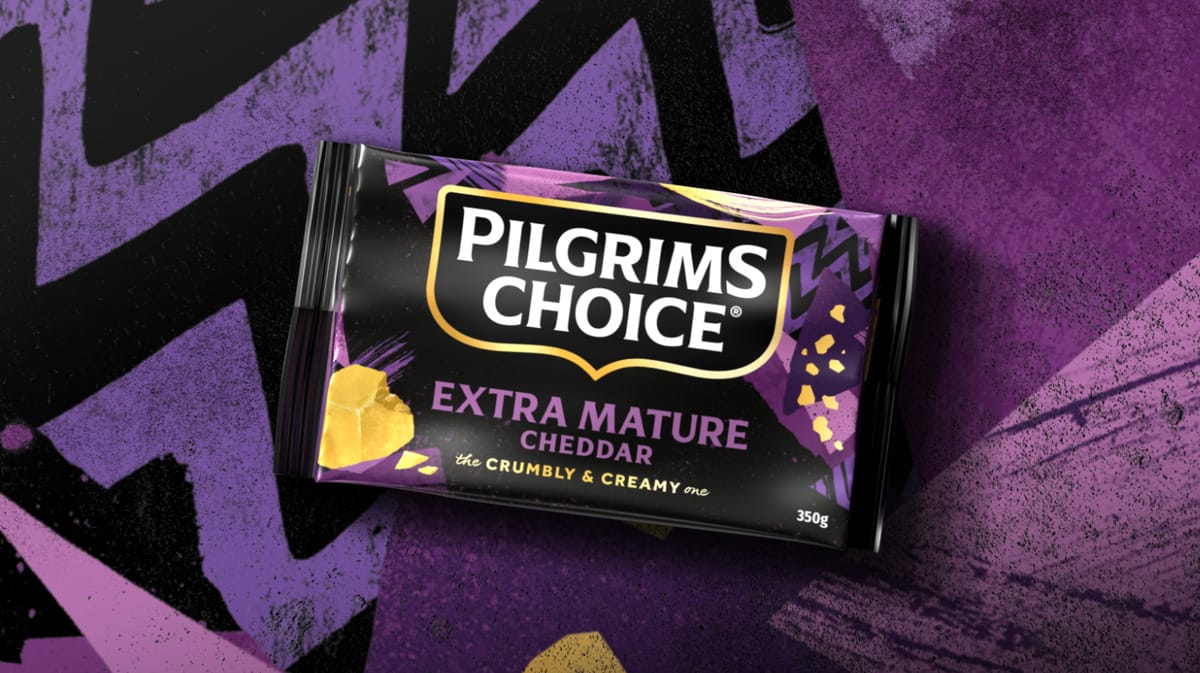
The challenge that Pilgrims Choice brand identity must to be better as other's and lower in price to win the "rat race". A distinctiveness and amplify as the boldly flavoured, adventurous cheese brand that food lovers were crave. Now, Pilgrims Choice cheese is the same shape as its competitors, and the packaging fits snugly. The amount of packaging material has been reduced further, because fewer microns in the plastic make the film thinner.
A new branding for Pilgrims Choice products by Brandon Consultants
Bright visuals also play a huge role. Tasty food prepared with the delicious cheese makes people braver to buy this product. The bold and savory image of the company leads to success without any doubts. "Dare to be different" says the head of the design company to serve and make a huge impact to Pilgrims Choice. Looks like the rebrand was done with love and devotion to the work.


